Overview
In the world of art the most expensive pieces get the most attention. Everybody is excited about the
“Mona Lisa” but not the next door painter's new piece. Our website's priority is to help our artists
promotes themselves and sell more of their art pieces.
Gallery '94 is based on a simple idea: Help to promote the local artists, help them sell their
products and introduce the news and events to the people who are not regulars
- The most used and appropriate style for this kind of website would
be minimalistic design
- Clean layout with no necessary elements with the most important (
product card) in the main focus.
- Main objective for our client was easy navigation. The users need
to finish their shopping as soon as possible.
- Easy understandable titles who explains the theme by it self , three
product cards and a view all-cta to continue exploring in the same category.
- The ability to finish shopping as a guest is a must have
feature.
- In order to add items to wishlist you will need to register or login
to the website but we managed to make it happen to users who wants to directly buy items without
login, and by giving only the most important info so the payment can proceed.(meaning the
website wont remember their info if they don't want to).
Research
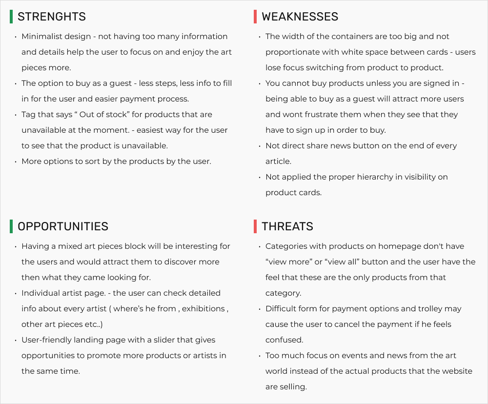
In terms of research we wanted to look to our competition first. We
picked ArtMajeur, Spacey, Bettershared as direct competitors and Lisson gallery as an indirect
competitor. We wanted to do a competitive analysis so we can compare their main features on the
site, and a SWOT analysis so we can see their strong and weak sides.
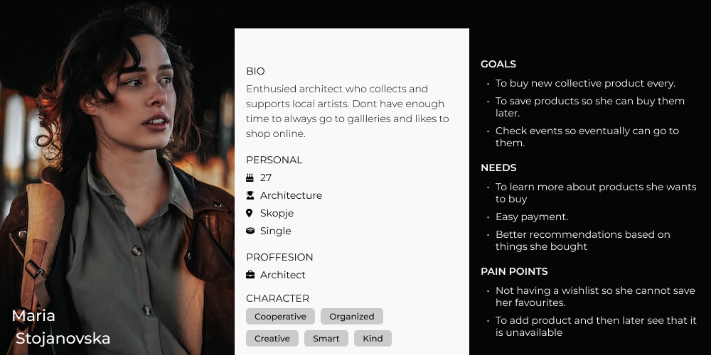
Then we wanted to set our main personas , find the key needs and frustrastions for them and make a
user flow and user journey to see how they react on our website. Lastly we wanted to set the website
architecture and create our structure so we can see all the pages in one place.
Findings
In terms of feature difference we discovered that our competitors are not
that different and use the same logic to show the product, with few different details in presenting
product card, some have artist location, some have price - directly on the product card ...
In terms of layout they all adapted the minimalist approach , they all had options for users to buy
without creating profile, more info on availability on product cards, and an advanced filter.
We had some negatives also , like not good structure specificly on homepage, too much white space ,
text too far from the image of the product, not clear what product goes to what category...

Building empathy
At first, it might seem that everyone is experiencing the same flow on
the website, search for product - buy it… but upon closer inspection the user research made clear
that there were divergent motivations and paths.
Creating personas helped bring some clarity to those differences, which would become important
reference points as functions developed.
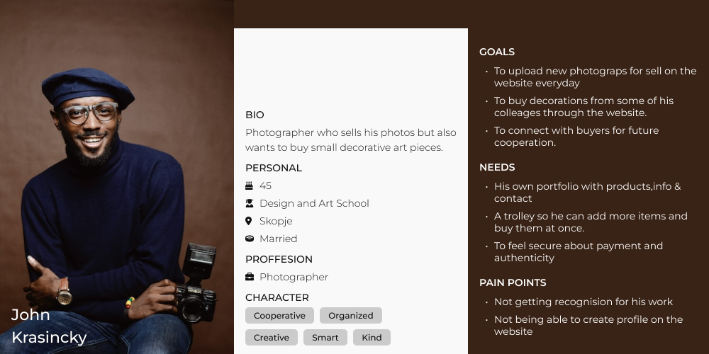
As research and design proceeded, We focused primarily on two personas because they represented
heavy emphasis of two key functions: Regulars who search for new art products ; and artists who look
for new places to sell their art, buy decorations and look for events near them.


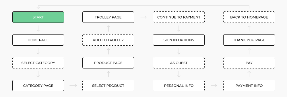
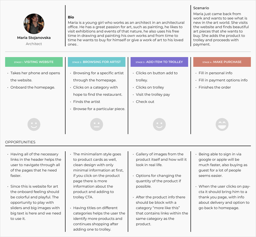
The flow and journey of the “every day” user
By creating and exploring the journey map and flow for the primary
persona and their typical tasks, I uncovered key emotional/procedural moments that our website
needed to address. The excitement someone might feel, when they visit the website. While searching
for a product it is a necessity to look for similar products. To ensure the user's flow - uncut, we
need to overcome these problems.


Structure and architecture
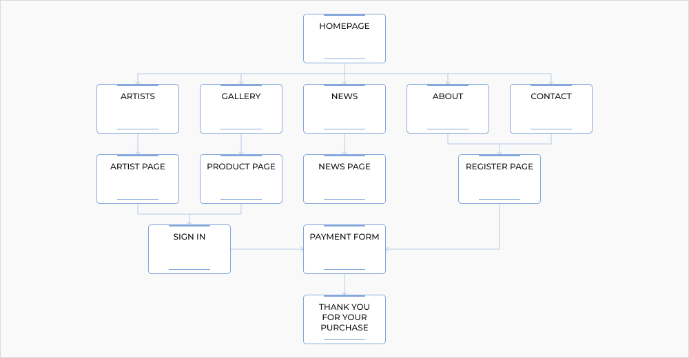
This site map, organizationally shows the three key task that the high
fidelity prototype would focus on:
1. Onboard experience and navigation through main categories.
2. The journey to buy products and payment section.
3. and the registration of new artists to the website.

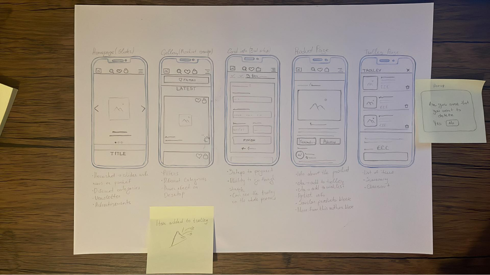
Starting the drawing process
Sketching in FigJam allowed us to explore design patterns and
similarities between pages, helping us to understand what we needed to implement in the layout of
the website. It also helped us to to identify the types of pages that we have where we can use
components, due to same layout so it would be quicker and easier to design them.

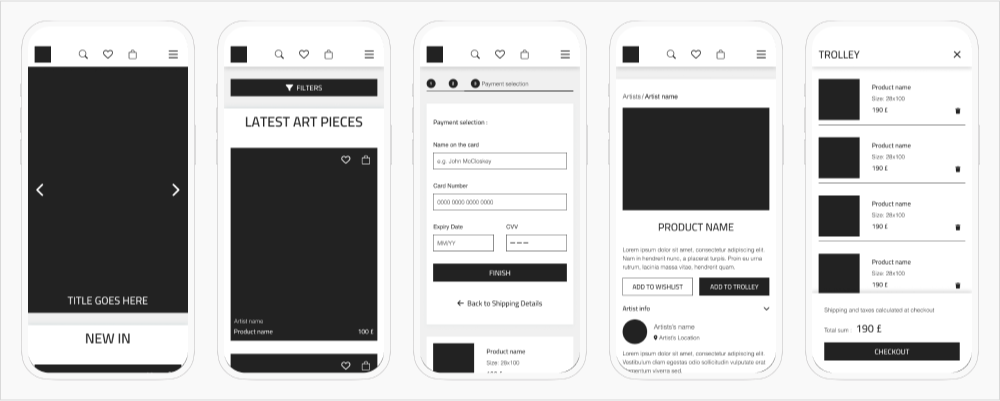
Digitalisation the sketches
Sketching allowed us to better understand how users expected to complete
the tasks they needed to do on the website. By studying the flows we understand what needed to be
changed and fixed for better experience.
We managed to make these changes and be able to complete the flow for a more fully realized high
fidelity prototype. Small details such as actionable and consistent iconography, and consistent
paths to get back, would become important elements of the design system.

High fidelity prototype
After transforming the wireframes into pages with colors and images and
apply our actual design we managed to make a prototype of all the pages of the website, and
presented our solution to the client. If you want to you can check the
desktop
version of the design as well, or if you are interested in the whole Figma file you can view
it from
here.
Enjoy!
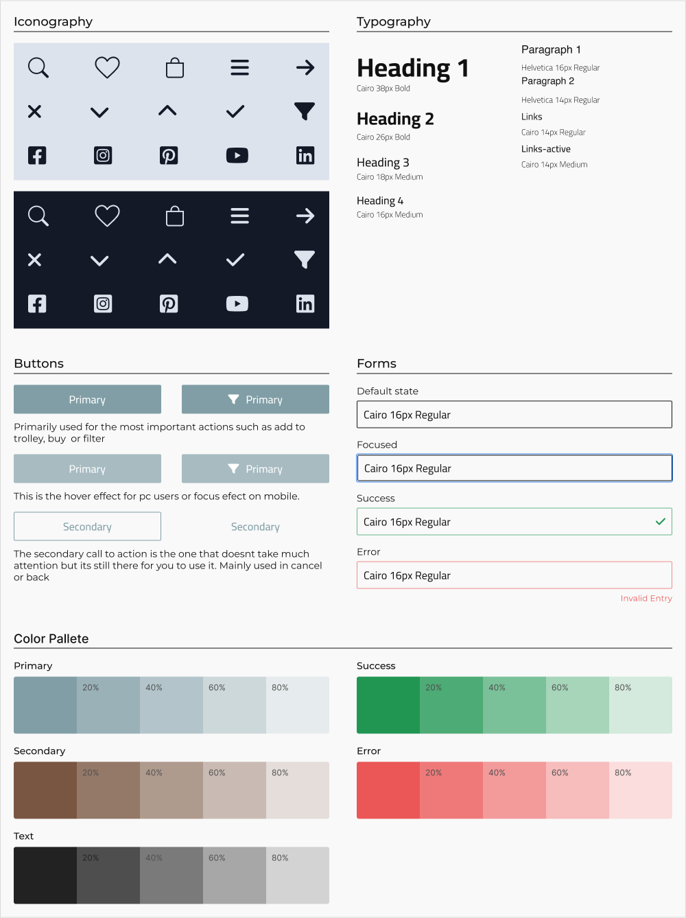
Building the design system
Because the nature of the website , the art itself gets the domination
with big images and clear text; simple button states and clear iconography would help make tasks
feel more manageable; and a single, modern sans-serif with large, open counters ensured legibility
and clarity in describing the products.

INSIGHTS & PROPOSITIONS
After finishing with our project we had a discussion about issues who
needs addressing in long term development:
1. Adding more types of art to the category for more attraction.
2. The opportunity to sell art equipment for artists who are already part of your website.
3. Exploring the possibility of creating more complex profiles with option to add images of
art pieces in ambient...
LESSONS LEARNED
When dealing with minimalist design you need to be consistent and careful
so the main features have the priority.
Placing the right information od product card is crucial, if you want the user to search faster and
discover more products.
The filter is the main feature for users that know what they want.
Having artist's info is helping the user to get familiar, find similar art and make the product more
personal.
The news and events part is not part of the sales items, but it attract people and the website have
more users.
THANK YOU FOR YOUR TIME !
