Overview
The best restaurants are always in high demand, always a live queue, even if you want to make a call you dont
know which restaurant has free tables plus the phones are busy on rush hours and in best case scenario they
will need to contact you back when table is free.
The clients had the idea to create application which helps people find restaurants and make a reservation. You
will be able to see the list of restaurants, their price , menu or the gallery so you can the interior, you
can reserve in advance so you wont need to wait in queue.
- The design needed to be adaptable to people who will use it on daily basis
and people who might use it once or twice, like tourists or someone who is trying something new.
- We suggested having the ability to create a profile, or sign in as guest will
help this because not all of the people react friendly to creating a profile, while being in town for 2-3
days, or people who are skeptical that they will use the app regularly.
- After the reservation you will get notification from the app that the
reservation is approved and, or email that says approved reservation.
- If you have a profile the app will send you notifications about approving (if
you enabled push notifications ), reminders about the reservation, or promotions about restaurants that you
visited. If you dont have a profile you will get an email with approved reservation or another
notification...
- You can upload your COVID certificate and the restaurant will know that you
are vaccinated, so you can actually make a reservation due to the restrictions from the goverment.
- Due to government restrictions that allowed only vaccinated people in
restaurants, we included uploading your certificate on your profile so when you come to the restaurant you
dont need to make unnecessary contact.
Research
After conducting the stakeholder interviews i got the idea of what the clients
wants. I knew that i need to find my competition, so i can see what features are the most used, how they
presented the restaurants, how were they managing the reservations. I decided to make a competitive analysis
and a SWOT analysis.
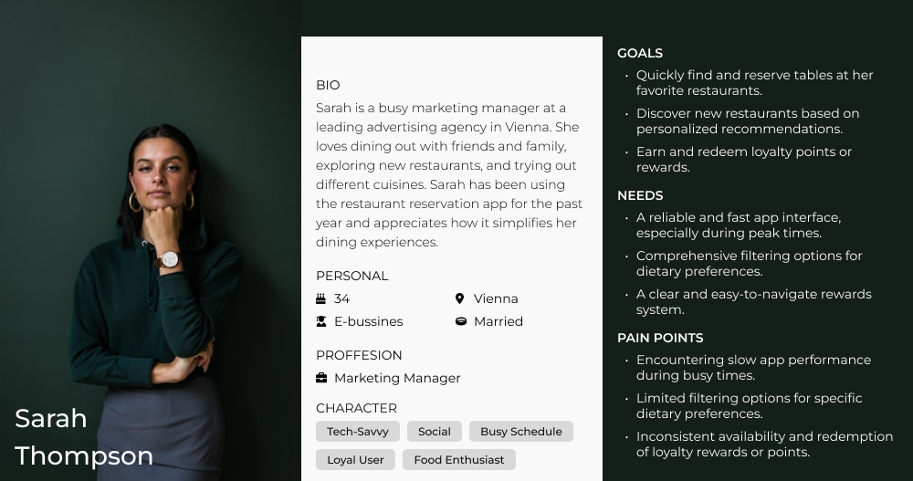
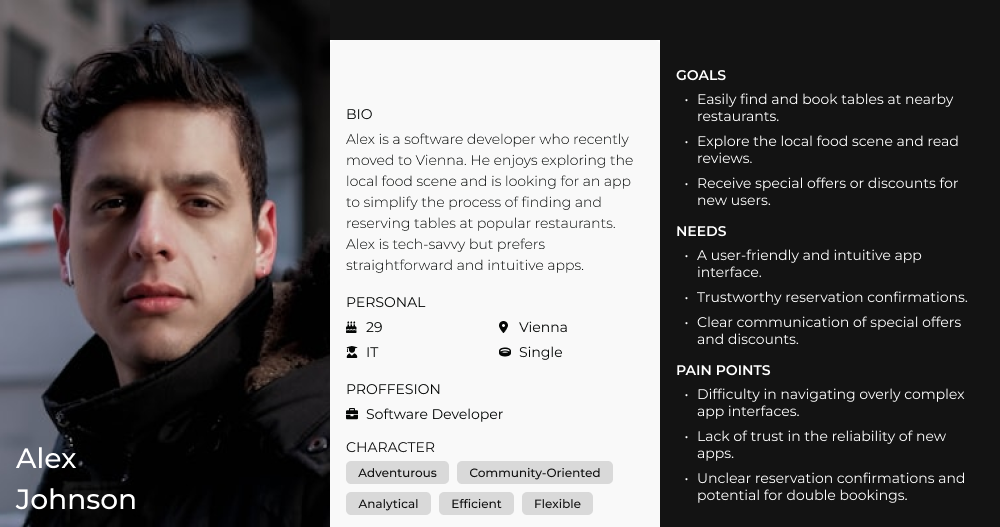
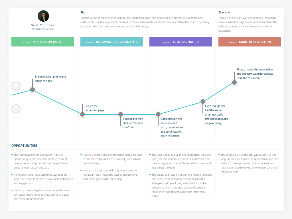
After that i made two personas from the information about the target groups that my client wants to focus. I
draw their flows on the app, the journeys for that flow and how they will react.
Lastly i sketched wireframes from the findings from research.
Findings
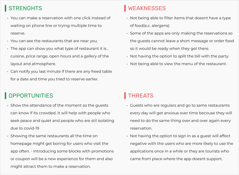
The first part of my research began at our competition. Firstly I made a SWOT analysis, so I can better see at
their strengths and weaknesses and I can clearly highlight their threats going forward and make sure that I
don't make the same
The competitive analysis was a success because the apps were more or less the same in terms of flow, card
information and presentation. After that I used all of the application and made a list of their strengths ,
their weaknesses found opportunities and threats that they would have.

Building empathy
The two types of personas were simple. The first one is an office worker who
goes
on lunch in rush hour and cant allow to be stacked in queue because they were time sensitive, are
already
users or they use similar applications and already have a few restaurants that they are regulars. The second
one contained the tourists that were visiting town and in need of an experience. They had problems
finding the
restaurants , they wanted to eat at a specific cuisine and always wanted to see the price range and the menu
before making a reservation.


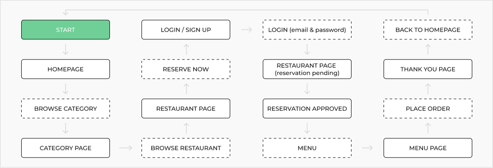
The flow and journey of the “every day” user
The application was made for two main purposes, one - searching for a
restaurant
and two - making a reservation. I decided to go for the scenario when the first persona goes to the app
finds
the restaurant, makes the reservation and don't make an account but continues as guests and fill in the
information.


Structure and architecture
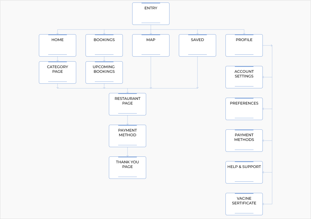
After conducting the research I was ready to make first visual contact with the
application, and made a site map. The main focus was on restaurant's cards and reservations. On boarding you
have the homepage with a lot of suggestions grouped in different categories, then you have your bookings( past
and present), the map is a big part of the application ,then you have your saved restaurants (favorites) for
fast access, and last on the menu is the personal profile.

Visualizing First impressions
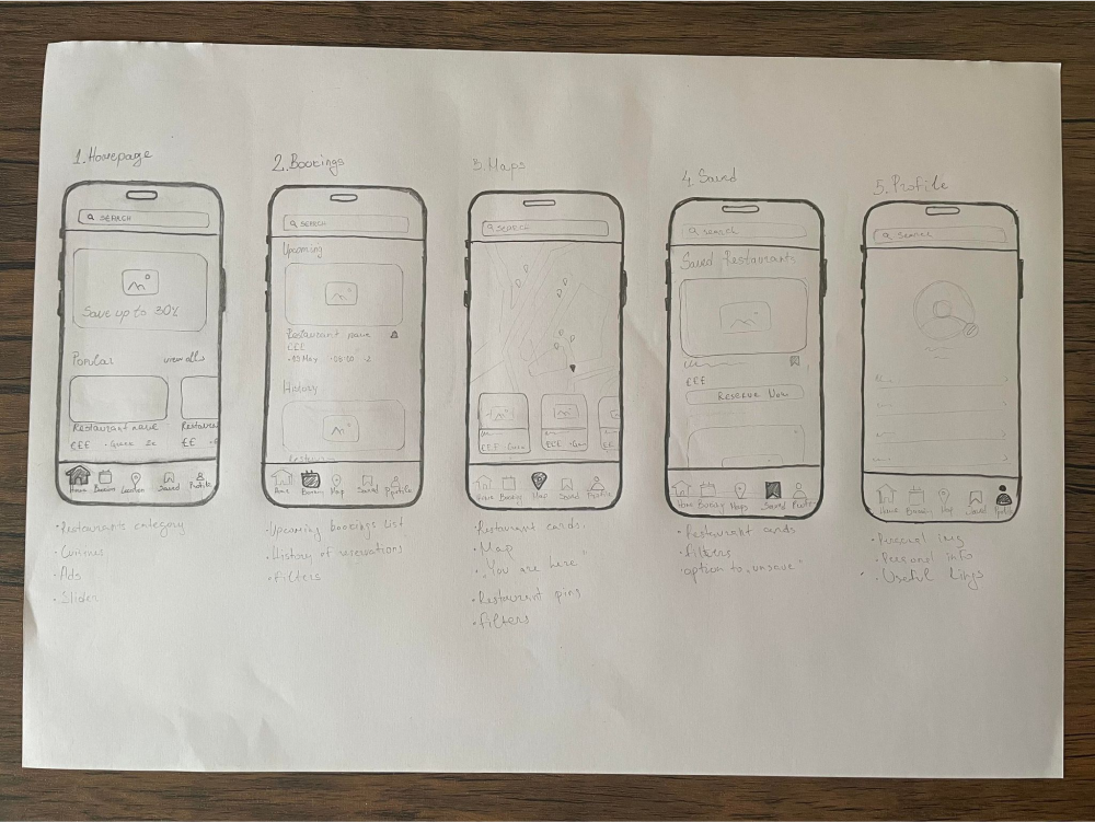
After the complete research I was ready to make some sketches and see how my
design would look like and if i have some points where i need to make adjustments or components that i can
reuse throughout the application.

Digitalisation the sketches
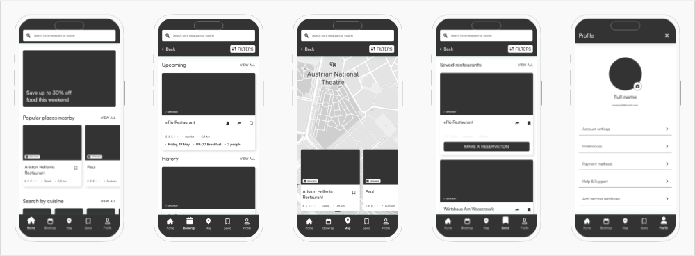
Making the sketches gave me the opportunity to visualize my design, but it still
wasn't a ready product that i can clearly see what's going on or how the flow would be adapting to the users.
Inserting text, image wrappers and buttons in the wireframes gave me a clear image of how the layout would
look like.

High fidelity prototype
The
high
fidelity prototype helped me to present the project to
the client. He was able to scroll through the pages, make a reservation, access the personal profile and all
of the main flows that the users would make using the application. If you are interested in the whole Figma
file you can view it from
here.
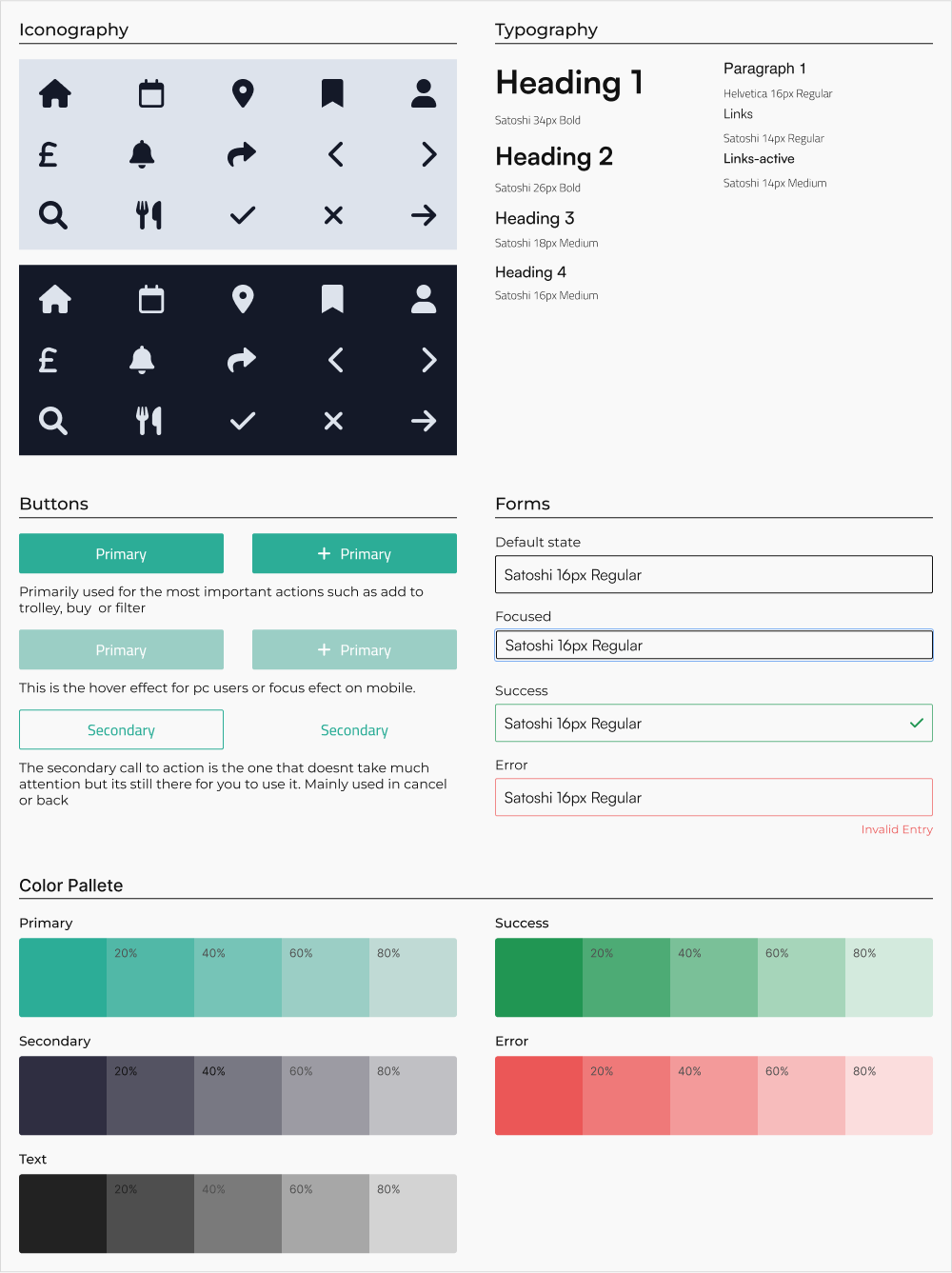
Building the design system
We talked a lot about the design system on the stakeholder interviews and
concluded that they wanted the main colors to stay the same . About the fonts we wanted to types : For the
paragraphs chose Helvetica - an open sans type of font with clear design easy to read and understand. For the
titles I chose Satoshi, more styled type of font that catches the attention of the reader . A variety of icons
that are used in the design help the user recognize actions and easily navigate through the menu. The main
part of the icons are part of the main menu , arrows or chevrons and explanatory icons for restaurant
features.

INSIGHTS & PROPOSITIONS
In the whole process of the design and research i had many ideas as to how i
would like the application to be, and i would like to present them :
1. Gamification - if with every reservation made the user gets some bonus, or achievement it would reflect good
about his opinion and he would feel proud or appreciated .
2. Sometimes users have special occasions , and they have special requests - it would be good to have checkbox
with multiple options for user to check on what kind of reservation it is or text area where he would describe
the occasion .
3. If the menu is accessible through the app then there is future ability to create one for the restaurant where
they can manage their reservations, menus and orders through the app.
4. Introduce friend list for users with profile - they can make invite to reservations, split the bill, share
moments etc...
LESSONS LEARNED
This project helped me understand how important is to find the most annoying
things for the users and how to fix their experience while using the applications
I understood how important are mobile applications for users who use them everyday and ultimately it helps
them passing their day smoothly.
While i did my research i found out that even if you have an applications that is in the air and its working
you must constantly find, fix or explore pain points or new features so the users continue using the app .
The main source for finding mistakes or pain points are the users. If you read their reviews and hear about
their problems you will understand how you need to address them and how you can fix your problems.
THANK YOU FOR YOUR TIME !

