Overview
Vidivaka brings the most important news to your digital channels, providing timely, fair and honest
information.
This project was presented to us while we were students at the Brainster UX/UI Academy. The company wanted to
redesign their website and desided to put the trust of doing that in students.
- The number of visits started to grow rapidly from mobile devices and they
needed fully responsive website for both mobile and desktop aproach
- We proposed that solution of this would be mobile first - approach, where we
start designing the mobile version first and than we adapt the desktop version from the mobile version.
- Usually they post 5 to 7 posts weekly, so they wanted their homepage to be
dynamic and to look different for their viewers ( imagine visiting the site 3 days in a row and the same
story pop-ups first )
- We wanted all of the stories from this week to be seen from onboarding.(at least
for the desktop version.). The priority will be given to the newest article, with big image, then in the
left container will be two more articles with smaller images, and last,containing the right container will
be the oldest news from this week, supported only by text.
- The multimedia stories needed more storytelling.
- Vidivaka has unique way of telling stories. They have stories supported by text
, video and podcast episodes so the reader can pick his way of listening. We suggested that the user should
be presented with the opportunity to scroll directly to the video or podcast player so they can get there
faster and start to listen or watch. The solution was adding buttons visible with onboarding on site who
would scroll you down to the player depending on what you clicked.
Research
During our stakeholder interview we talked about research that their team already
conducted. They presented us with three target groups that they wanted the solution to be based on. The main
target was the younger audience who were mainly users already but their numbers jumped high due to the
websites authenticity of telling stories. The next ones were the older audience , mainly computer users who
wanted to read about local stories, politics and also their comments about articles were increasing. The third
group were the journalists who wanted unique way of re sharing the stories.
Next thing that we talked was their competition or websites that they looked up to.
They were thinking big, already having in mind websites like The Guardian and NewYork Times like
some of the biggest websites in this field in the world, NowThis, The Vox were also websites
that are worldwide famous and we added Al Jazeera in this list because of their ability to tell a story
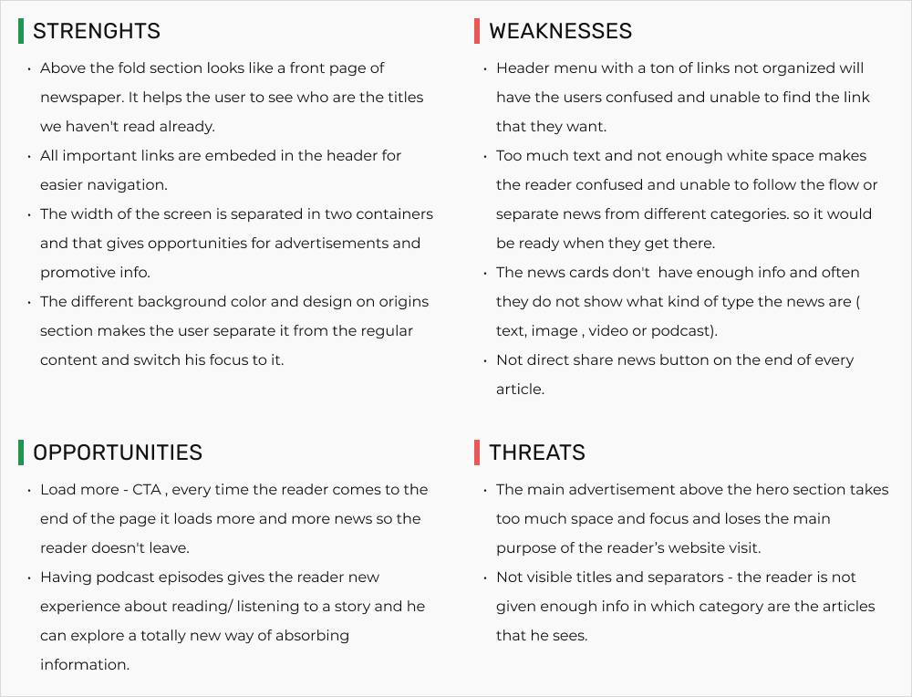
with videos, texts and also podcasts. From here we made a SWOT analysis of their pro's and con's and made a
summary of what should our website learn from them.
Findings
The first part of our research began at our competition. Firstly we made a SWOT
analysis, so we can better see at their strengths and weaknesses and we can clearly highlight their threats
going forward and make sure that we dont make the same mistakes. Also we tried to find opportunities from it
by conducting a brainstorming sessions where each of us presented an idea for a new feature or how should we
design some parts of the website.
made a list with features that most of our competitors had in their websites and decided to compare them one
to another to see which features are not consistent in their designs. We concluded and highlighted some the
key features that we decided to go for and have a better experience for their users. We added social links ,
CTA button for loading more news when you reach the end of a site (automatically more news seemed confusing
and fast for our older audience), and we added hashtags because they helped the users for easily finding what
the article is about and fast searching for other article similar to the said article.

Building empathy
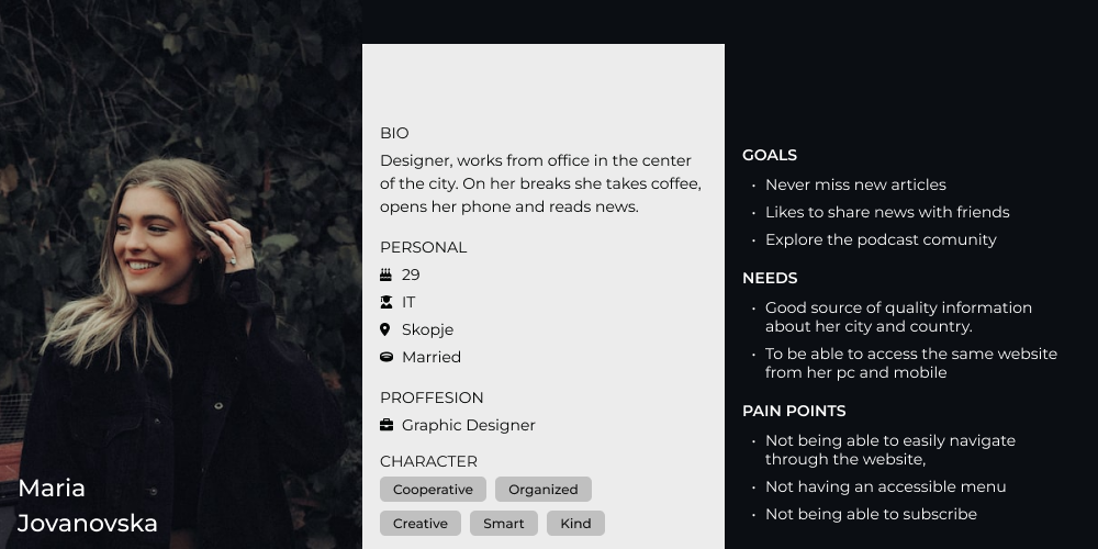
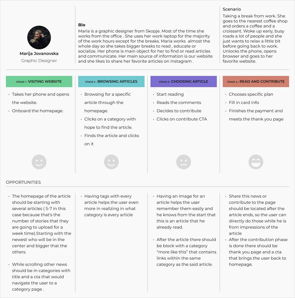
After the research we decided that two personas could cover the majority of our
users. As the main persona we choose the younger audience. Works from office , always wants to be in time with
local news , regular subscribers so they wont lose any news. They are mainly phone users who use their phone
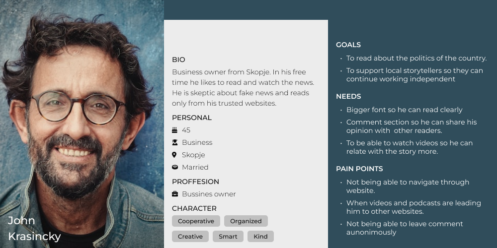
every chance they can. The second persona is the older audience, people who mainly uses their personal
computer for reading. They also want to read every news , they want to support the local journalists and
website which they think have accurate news. Main part of their usage of the website is the comment section
where they comment and communicate with each other.


The flow and journey of the “every day” user
Because its a newspaper website the user didn't have any complex flow or journey
while on the website. They simply find an article read it and if they feel they have more time they will
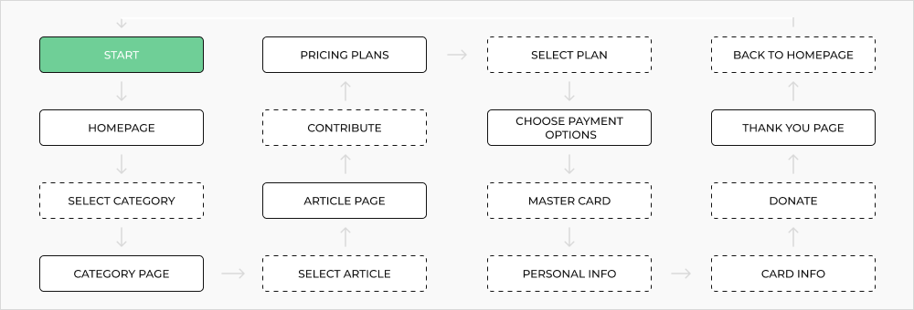
continue reading another etc. The flow that we wanted to cover was about the user who wanted to contribute to
the website after reading an article. They will visit the website search for an article, they see a category
they like, click on it, then see articles similar to one another , clicks on one , read them and at the end of
the article there is a cta who leads them to card donations page. They chose their plan , choose their payment
option, complete the form and it takes them to a thank you page. There you have a button that sends you back
to homepage so you will be inspired to read another story and don't live the site.


Structure and architecture
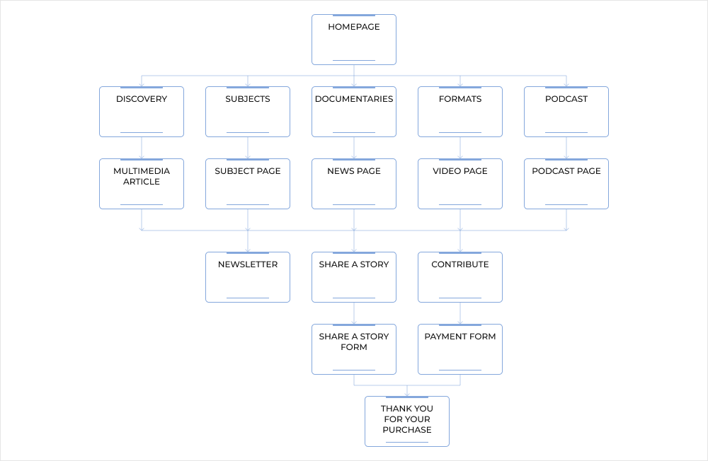
After conducting our research , next on the list was creating the structure of
the website. The main logic was colorful homepage with blocks from every category of news. Next were links to
pages who contain the main type of news , from all of those pages you could visit every article from said
category. While you are on an article page you can visit article pages similar to this , or if you feel
inspired you can access the form for sharing your story , you can contribute to the website or join our
newsletter.

Starting the drawing process
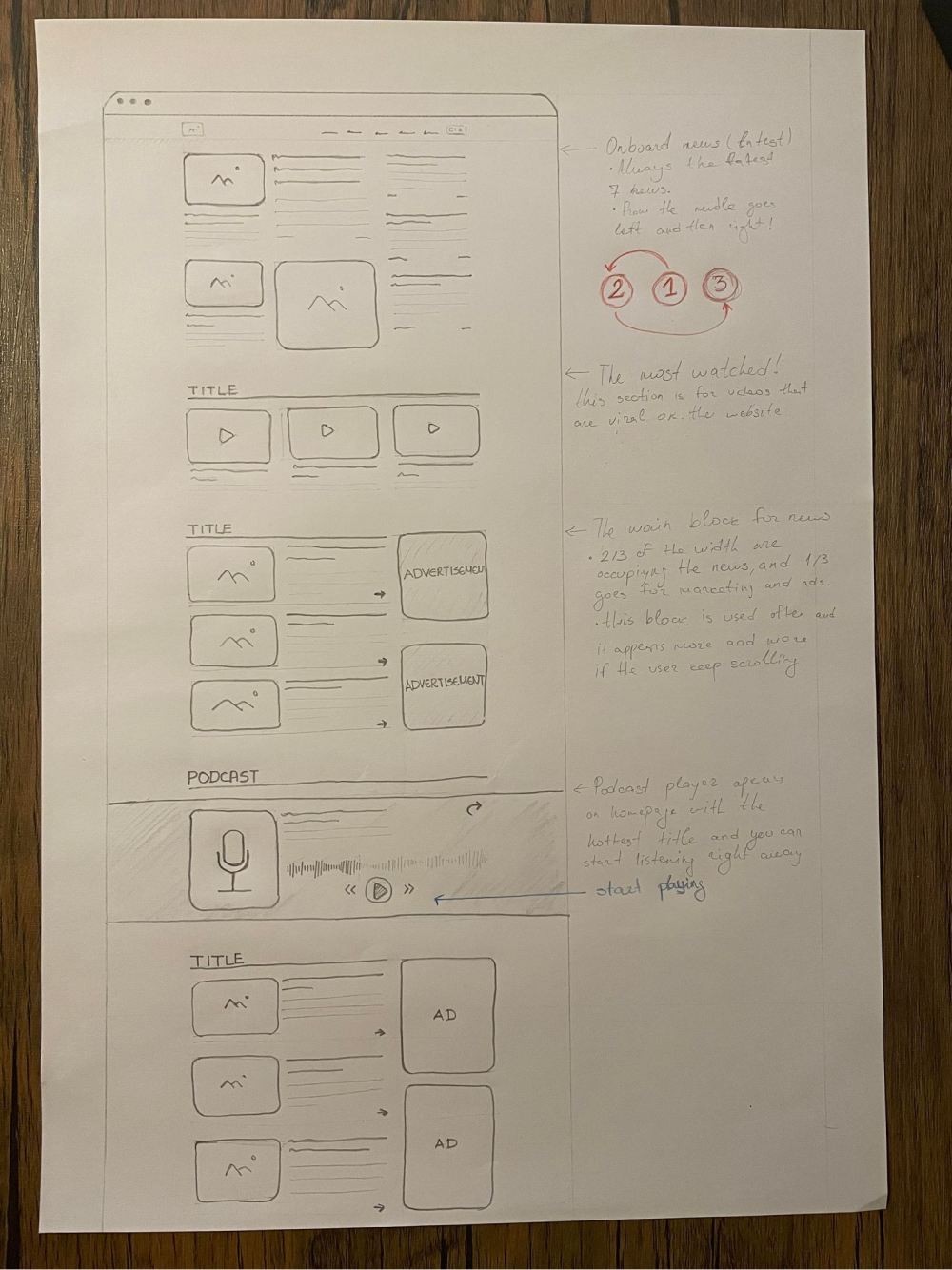
Sketching helped me to understand the patterns and layouts that i needed to
follow so i can have consistency in the design. It also helped to identify the screens that were similar in
the layout type and where i could reuse components so the design part would be much faster.

Digitalisation the sketches
While the low fidelity wire-frames were fun and helped me understand the flow a
lot i still needed an example in which the frames were more visual and more understanding. The high fidelity
wire-frames gave me what i wanted exactly. I used lorem ipsum text for textboxes and one color filled squares
for media such as video , image etc... This looked more understanding and visually adaptive.

High fidelity prototype
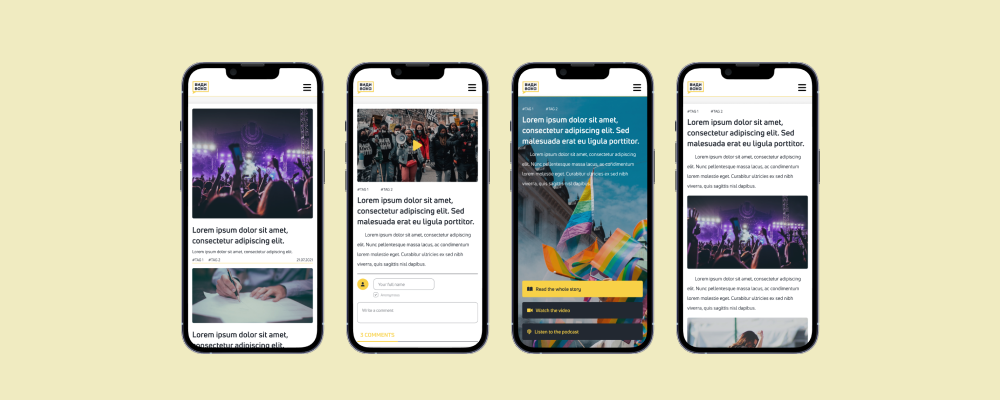
The high fidelity prototype helped me to present the project to the clients. They
were able to scroll through the pages, see how the news page were constructed, the storytelling of the
multimedia page news and all of the main flows that the users would make using the website. If you are
interested in the
desktop
version , or the whole Figma file you can view it from
here.
Building the design system
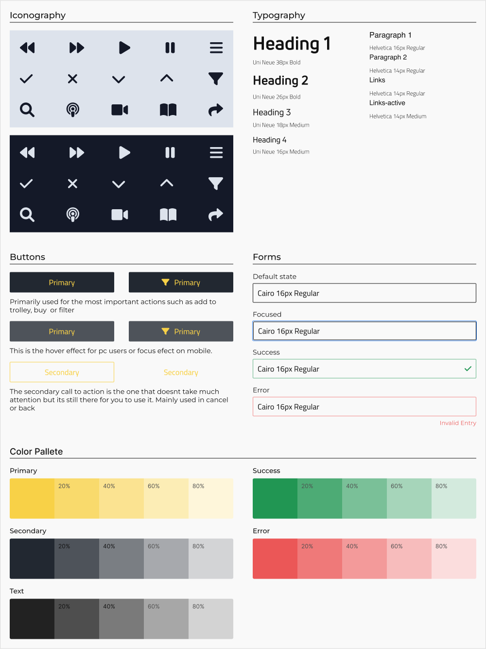
We talked a lot about the design system on the stakeholder interviews and we
concluded that they wanted the main colors to stay the same . About the fonts we wanted to types : 1.
paragraphs font we choose Helvetica an open sans type of font with clear design easy to read and understand.
For the titles we choose Uni neue, more styled type of font that catches the attention of the reader . We have
a variety of icons that we used in the design. Part of them are for video and podcast player , or just for the
accordion menus or the main menu.

INSIGHTS & PROPOSITIONS
While we were designing the project we had a few brainstorming session and we
talked about insights and we wanted to present them what we think they should implement in the future.
1. The header should contain more links with specific categories (best would be to see what are the
categories that the users visit the most).
2. Ability to create a personal profile will be good for the younger audience because they can easily
share to socials like that.
3. Due to security reasons and hate speech , they should switch the comments section from anonymous to
profile commenting.
4. While its good to have podcast player on the website, the more experienced users, or to say the
users who listen to podcast regularly might want to listen them on other platforms. The option to switch to
another platform would be better for them.
LESSONS LEARNED
This was my first full project presented by a real client, and also a first team
project. During this time i found out that not everything is the same as it is told in books.
As my first real project i wanted it to be perfect so i tried to implement every feature or idea that the
client wanted to. I learned how important is to ask question about their idea of the project, their idea of
the design and what path they wanted to follow.
The main part was how to communicate with each other. At the start everyone just informed the others what he
is going to do and isolated to work. Then when we saw that we are not in sync and design cannot be done
without communication, I kinda took the lead role. After finishing the research we were on the same page as
how we would need to continue. It was fun !
THANK YOU FOR YOUR TIME !
